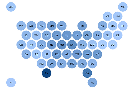
Traditional geographic maps can be misleading when larger states visually dominate, while smaller ones fade, skewing the interpretation of data. When you need to compare performance across states, the Honeycomb Tile Map makes it easy with clean, easy-to-read heatmaps that focus on the data, not the map. By using equal-sized tiles for each state, it removes geographic distortion and keeps comparisons fair and clear.

Honeycomb Tile Map Key Features & Benefits:
-
Equal-Sized Tile Visualization: Mitigates geographic bias for accurate state-by-state comparisons
-
Color-Coded by KPI or Segment: Brings heatmap-style clarity to campaign, sales, or operational metrics
-
Optimized Performance: Fast-loading, efficient design suited for dashboards and embedded analytics
-
Flexible Display Styles: Choose from hexagonal or circular tiles to match your aesthetic and platform
Built for modern dashboards, this map excels at visualizing metrics like adoption, workload, or revenue by state, without visual distortion. Whether you're managing a national campaign, allocating field resources, or tracking regional trends, the Honeycomb Tile Map puts high-impact insight front and center.
